One of my favorite episodes for MadMen was from the first season, when Don Draper’s brilliance as a creative director was still to be demonstrated. Up until this point most of his pitches and brainstorming sessions showcased his confidence and assertiveness, but actual genius had yet to be proved.
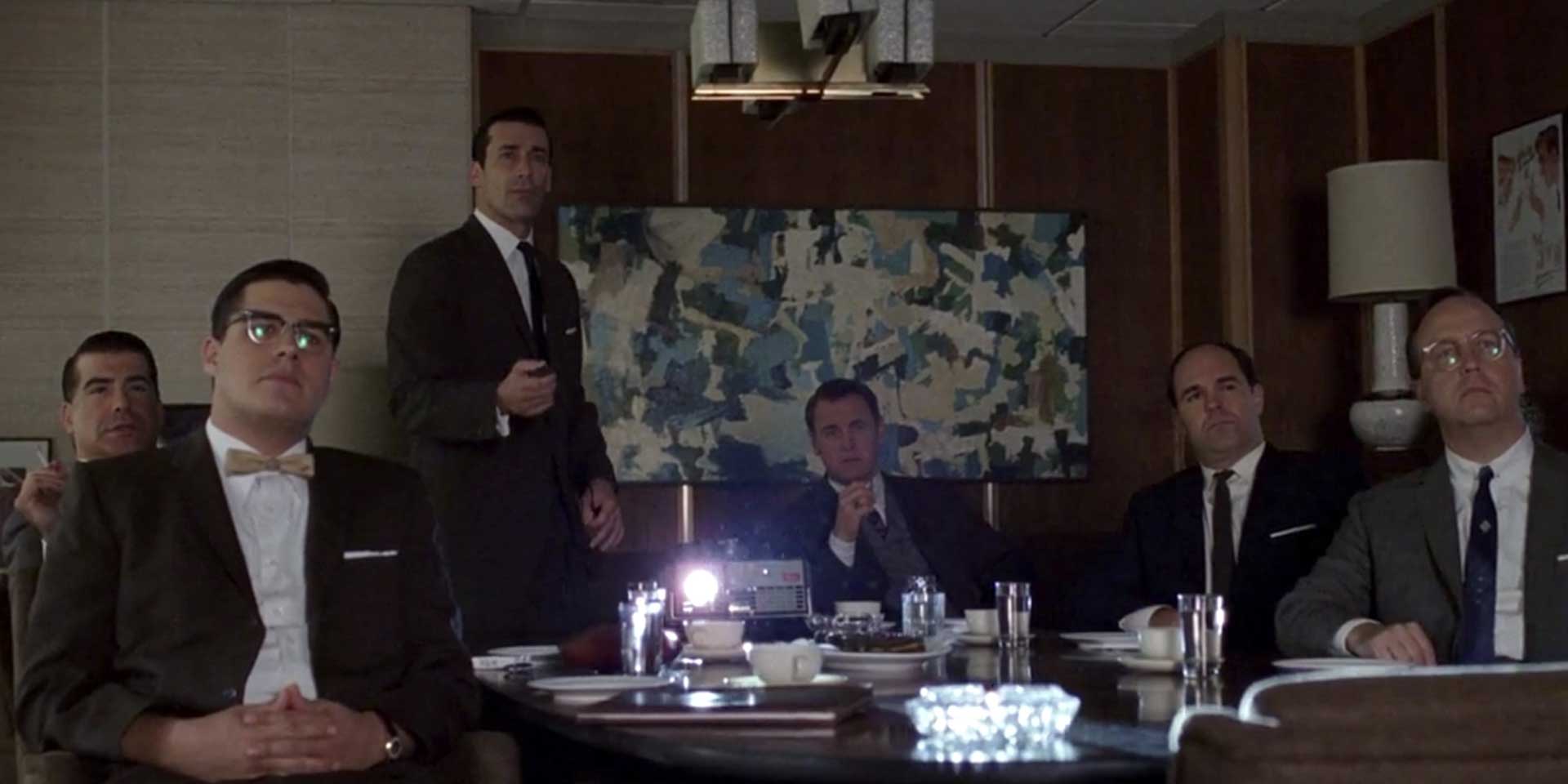
Don’s big moment came during a pitch to Kodak — they company was shopping their new gadget to ad agencies and Sterling Cooper got the invite. Now Don has to deliver.
Kodak calls their new gadget The Wheel — it’s an automatic slide projector that loads slides from a wheel that can be moved forward or backward. (I mastered this device as the head technician in 7th grade A/V) Don’s genius is in recognizing that the gadget is insignificant. The specs, operation, the novelty of how the slides load — none of it matters. What matters is how it makes people feel to watch their precious pictures of the baby’s first step, dad’s last barbecue, David’s first hit, flash past them in sequence. Don tells Kodak that their device isn’t a wheel. "It's called The Carousel. It lets us travel around and around and back home again.”
I woke up yesterday thinking about this scene and it hit me: this is why I’ve always believed higher education websites must prioritize content above design. That’s not to say design isn’t important - I’m a designer after all - but that your website is only just a wheel. It should be well designed, supremely functional, and elegant to use. But it’s still a gadget. Your content and your brand story – the stories you tell about what you do, why it matters, and why your students thrive because of it — that makes it a carousel.


