BRAND PLATFORM
CONTENT STRATEGY AND DEVELOPMENT
CONCEPT AND DESIGN
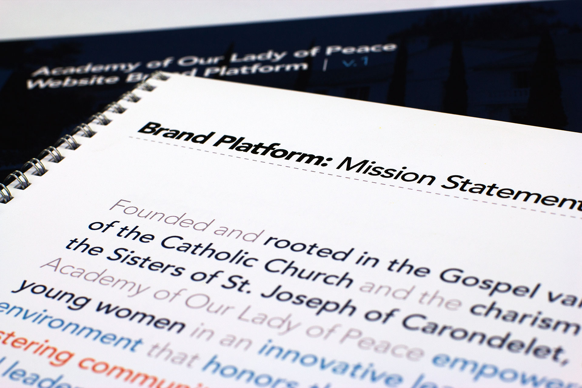
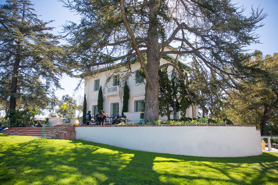
Some places just speak for themselves. The Academy of Our Lady of Peace is the only all-girls high school in San Diego, CA, and has been in existence since 1882. We were very proud to work with the Academy to re-fresh their website, and discovered early on that a brand platform to guide the website messaging strategy was needed.
The Academy was very motivated to find efficiency and cost control with this project so we proposed a re-skinning of the their WordPress website, avoiding an extensive review of the IA and content. We developed a new home page that achieved all of their content objectives, specifically their desire to create an immersive experience that communicated their core values and ethos. Landing pages for major sections and subpages were styled to follow the new theme.
“We were thrilled to collaborate with Ken on our website and the results speak for themselves. He helped us realize our vision and re-define our website brand strategy to accurately reflect who we are to our community.”
DR. LAUREN LEK, HEAD OF SCHOOL, ACADEMY OF OUR LADY OF PEACE
Building a brand platform
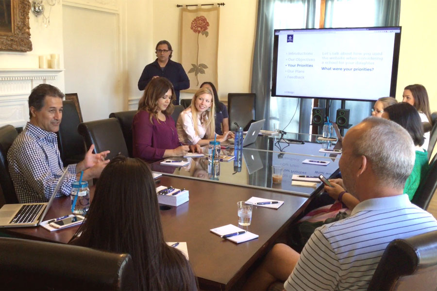
Working with the Academy's marketing team, we crafted a platform from established brand statements and themes, building them into brand pillars. These pillars were then used to devise a home page content plan and guided our design and messaging strategy.
“Our new website provides a refresh to our brand while preserving our history, but with new and interactive features. The website redesign brought us into the 21st Century and better engages all of our constituent groups. Ken was a delight to work with. He took in our feedback and provided his expertise to help us tell our 135-year-old brand story in a beautiful way.”
EMILY PIPPIN, DIRECTOR OF COMMUNICATIONS AND MARKETING, ACADEMY OF OUR LADY OF PEACE
A smart redesign
We developed a redesign plan that solved the Academy's marketing and communication challenges without a complete redesign:
The home page was redesigned to focus on prospective students and parents, and current student and parent portals were created to better serve these primary users.
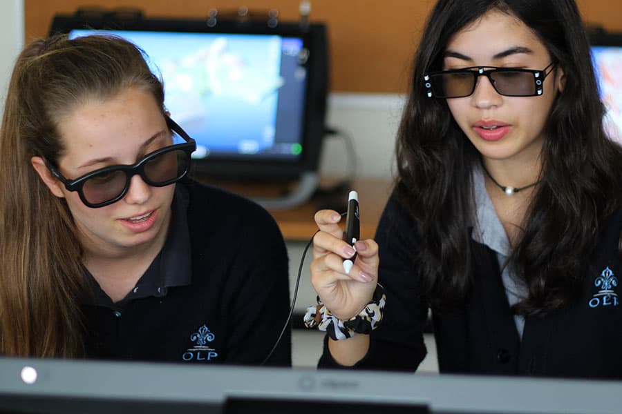
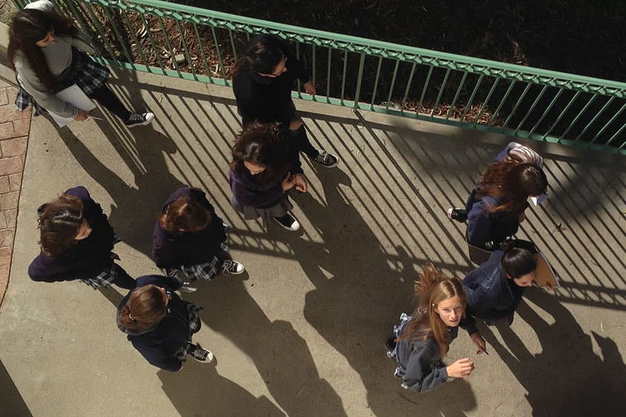
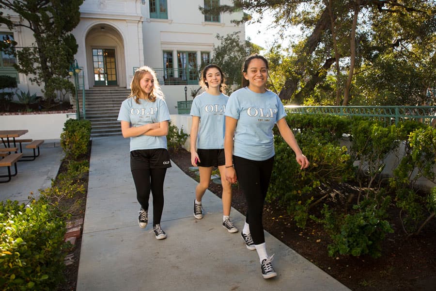
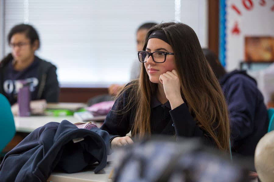
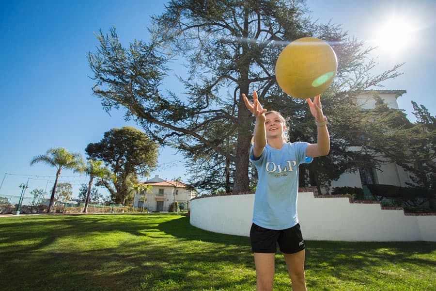
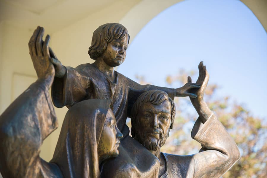
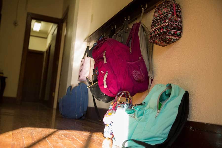
Planned and art directed a multi-day photoshoot to capture hundreds high-quality day-in-the-life images used on the website and in other media.
Next, we made minor design adjustments to existing templates to align with the new home page direction.
Finally, we updated newsletter templates to match the website using our new photography and visual elements.
The result is a fresh, updated website built on the existing CMS with a minimum of effort and expense.
